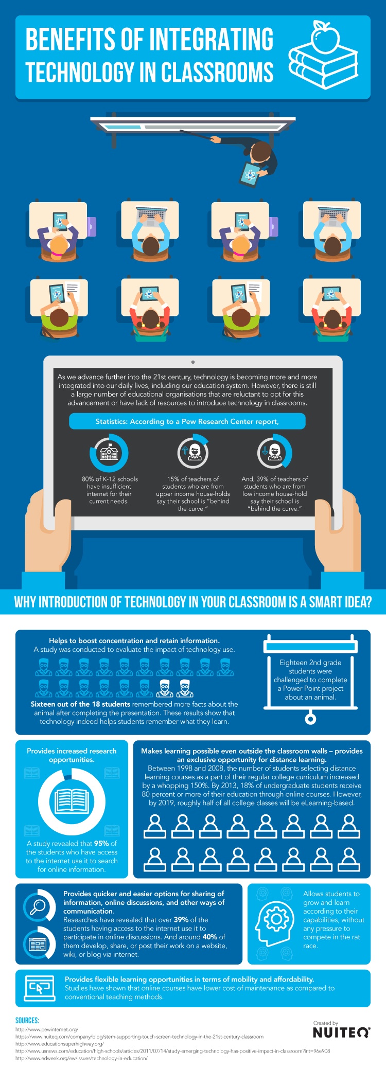
OMGosh can't begin to tell you how bad the content and presentation of this infographic is, considering it is supposed to be representing the benefits of integrating technology in classrooms. Students sitting in rows in a classroom. Really? Teacher at the front - really? How about some modern learning environments? Powerpoint? Really? How about creating their knowledge on a presentation of any kind? Saying 95% are using internet for research - how limiting, how absolutely
underwhelming use of the internet , what about activities for learning? (Reminds me of the OECD report that said screen time was bad for students' achievement. Turns out the ones having 4+ hours of screen time AFTER SCHOOL were the ones doing not so well.) Differentiated learning is reported on in a very small corner of the poster - and what about personalised learning? Big let down, this infographic.
 Find more education infographics on e-Learning Infographics
No comments:
Post a Comment